The Technology genre can be broken down into many subgenres but for my analysis, I have chosen to specifically focus on consumer technology (aimed at computer and personal users) and gaming magazines (aimed at PC gamers). These two subgenres share many conventions, but there are key differences which will affect my design decisions.
Consumer Technology



The subgenre of consumer technology is aimed at individual buyers of personal tech. They span a range of magazines such as Mac Format, PC Pro and Apple Magazine and they focus on helping their audience buy and use technology in their everyday lives. Even within this subgenre, we can also see a split between PC and Mac magazines, however the magazines follow many of the same conventions.
These conventions include product focused imagery – the cover focus is usually a product featured In the issue. They also go for clean minimalist layouts and text, which align with clean technology branding, and the more premium the magazine and technology (such as Apple Magazine), the cleaner the more minimal the cover becomes.
They also use large mastheads, consistent between issues, for brand recognition as feature colours and style are different greatly issue to issue. Magazines in this genre conventionally use language that is considered “expert” with jargon, to appeal to tech users and people who want to get the most out of their products.

This is the Apple Magazine coming from Uk’s biggerst Apple Brand titled Mac Format released on October of 2020. Which was the issue date written on the top hand corner of the magazine right on top of the masthead. The masthead is decpicted as big and entitled possibly seen as a recognition of the genre and showing off the importance of this brand allowing the audience to signalize where the magazine is coming from. Such conventions such as the coverline is Apple Genius which is written in bolded text with a small text of word written on the top of it saying ” Be your own Apple Genius”, which in technical terms states that Apple Genius refers to the technical supports which cope with fixing devices and the idea of this magazine is in promoting the accessible methods of solving issues on devices if having to encounter one. Overall, the magazine looks clean and polished aligning with the way Apple magazines are usually designed to be looking clean and polished focusing on a more premium aesthetics and market campaign. A noticeable feature to mention is the setup of Apple’s unique UI(User interface system, as having clear fonts and layout resembling greatly with the its color connotations being yellow as known for processing optimistic and positive vibes over a formal connotation, often shown through darker colors.
Gaming Technology



The subgenre of my magazine is focused on the gaming industry including such games such as Cyberpunk, Sassins Creed Valhalla, and Call of Duty Modern Warfare 2(2022)version of the game.
Throughout the genre, the masthead is always listed on the top hand of the magazine, possibly the most visible set of word a reader would be able to see, and the words are attention grabbing:
PLAYSTATION
PC GAMER
PLAY
This is used to gain readers attention quickly by setting up a gaming magazine as the front cover and larging the texts of the masthead letting buyers easily recognize where the magazine came from. The coverlines appeal to the audience with Unique selling points, such as “Inside CO Project Red’s Stunning RPG” and vocabulary that the target Audience will understand. The USP is enhanced by the main image as characters from the game, often superimposed over the magazine title because it is well known enough to be partially hidden. The genre fights against competitors by adding in Buzzwords and puffs to stand out on a crowded game magazine shelf.
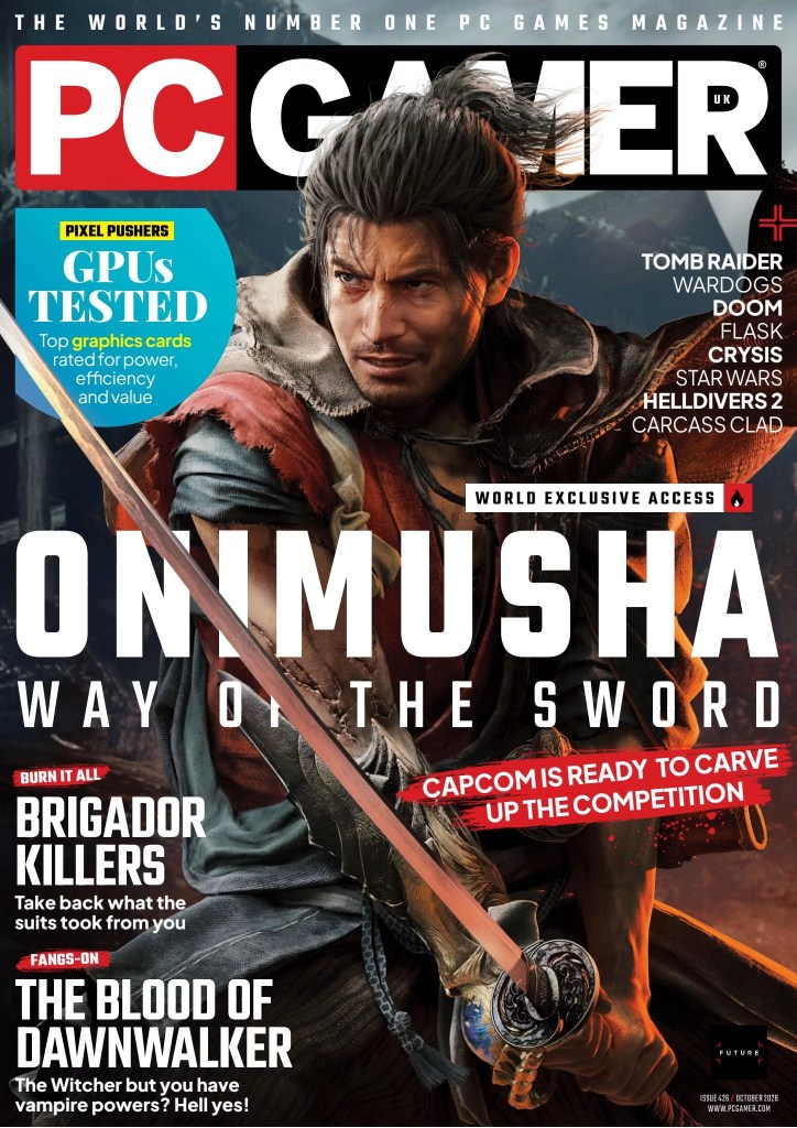
The magazine under analysis here is Onimusha from PC Gamer, a game pre-released to be on October (2026), which is also the issue Date on it as well. The use of color connotation is grey black, with a less positive or optimistic aesthetics background but relates to the magazine being more serious and mysterious. This also contrasts to what this magazine is about, a Japanese warrior holding a sword sitting in a position ready to fight. But also, in the coverlines as well, like Way of the Sword statement which sits right below the character’s name in the mid -section point of the magazine, could possibly be a teaser of the game, featuring what the game’s potential contents might result in as the game releases approaching this year’s October. The Use of typography is rather not clean or polished like Apple magazines when analyzing their magazine。
Summary
In summary the subgenre I’m most drawn to is the consumer technology genre, spanning on a selection of top Uk magazine brands including Mac Format, Mac World, and PC Pro for Windows. The use of larger mastheads, bigger lines and brighter color connotations in their magazine overall make the magazine look bigger in text clean and polished as well as offering a more premium aesthetics. The design of their magazine specifically differentiates itself apart from their targeted customers, such as for Mac and Windows technology buyers are usually business people or college students pyritizing work over leisure time, while gaming magazines are specifically more attracted to young teenagers between the ages of 10–25-year-olds, or Generation-Z, demographically speaking.


Leave a Reply